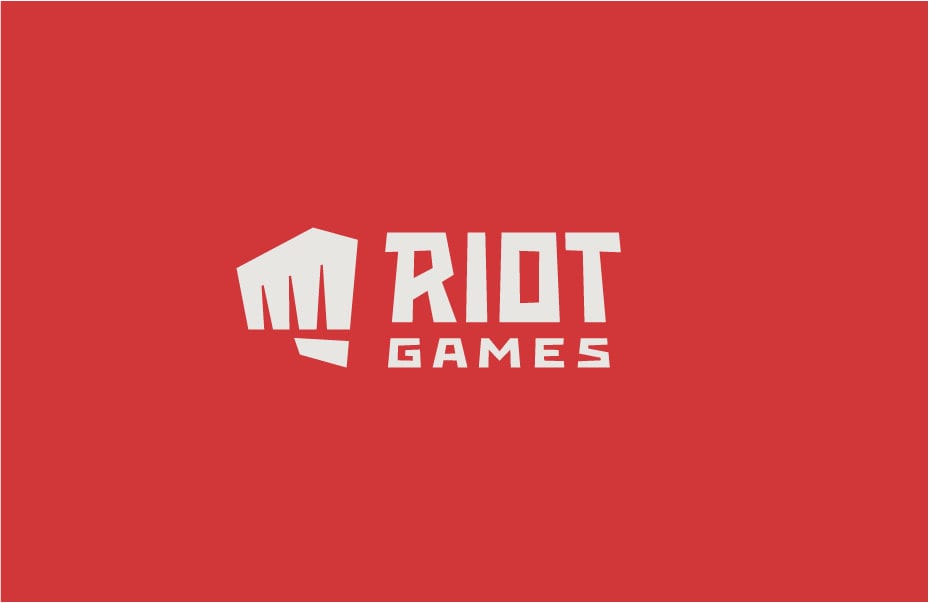
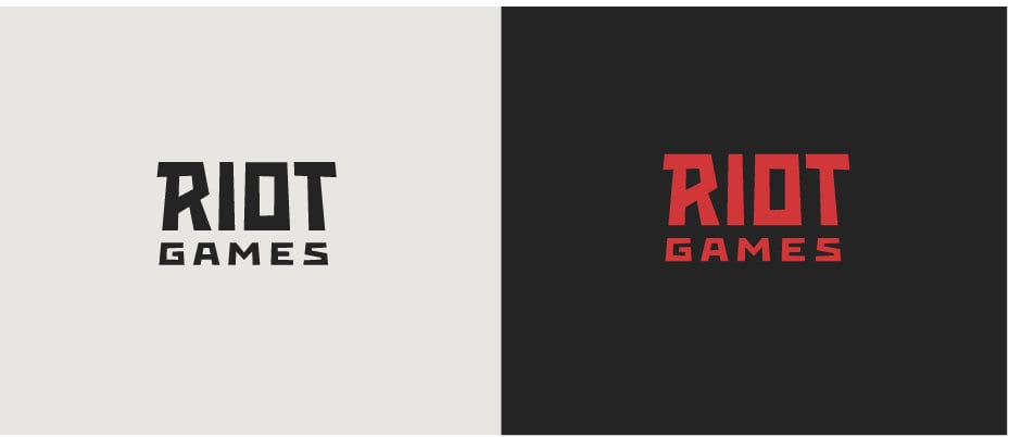
Riot Games today announced on its Weibo account (China’s version of Twitter and the country’s largest social media platform) that it has debuted a new logo for the company. The main idea behind this re-design is to make the Riot Games logo more suitable for small screens, such as mobile devices. The company logo has never been changed since the very first art director drew it, and many things such as technology have since vastly progressed.
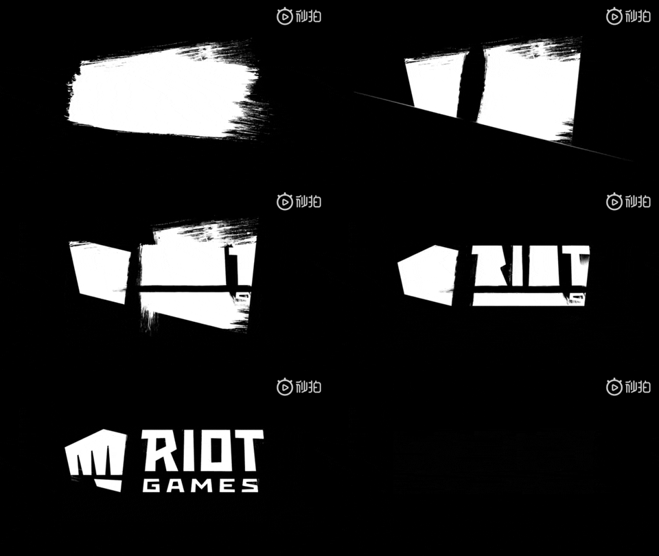
Another major focus of the Riot Games company logo is to move out the “fist” design and separate it from the main text. The “fist” is a main part of the company’s identity, and felt like it was losing its status on small screens. Hence, it is now positioned on the left side and sport the same height as the company name. The “fist” is also now the official icon of Riot Games. It is not stated if the new Riot Games logo is just for the Chinese market, though.
