 Well, somehow, a friend of mine with industry links got me an account for Ragnarok 2’s 2nd Closed Beta test. I gave it a short 10 minute spin, and decided I was better off playing back DC Universe Online. In the past, I would have loved Ragnarok 2. But fast forward to 2011, the game is just too dated. Well, some might argue upcoming games like Lime Odyssey is of the same genre too, but at least Lime Odyssey’s color palettes aren’t as dull… Well, here are some screenshots from the game which lasted, as mentioned, 10 minutes for me.
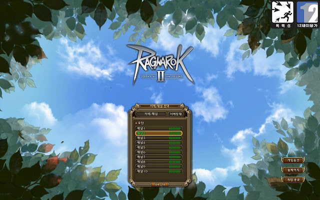 |
| The server/ channel selection screen. Looks like there are not many people since all are in the green of health. |
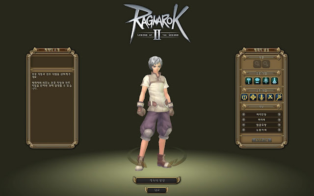 |
| The character creation screen. |
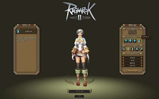 |
| The doctor profession. Profession is like a character’s life skill, not class. |
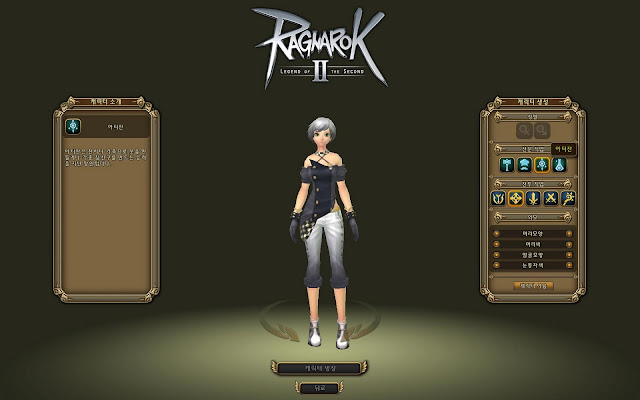 |
| The tailor profession. |
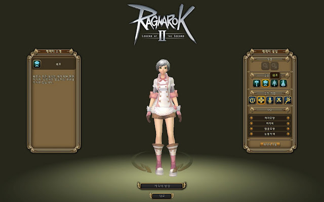 |
| The chef profession. |
 |
| The blacksmith profession. |
 |
| The hunter class. |
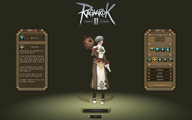 |
| The acolyte/ disciple class. |
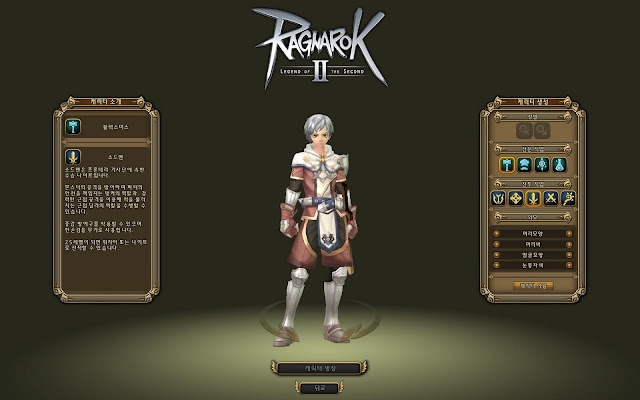 |
| The swordsman class. |
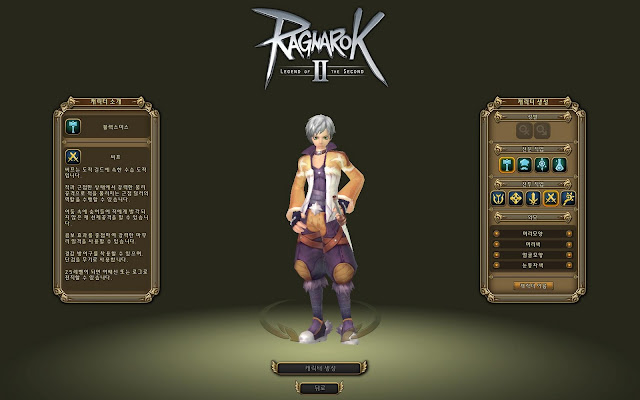 |
| The thief class. |
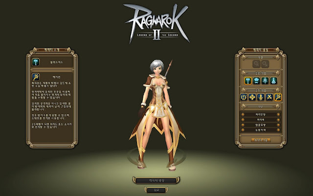 |
| The mage class. |
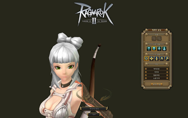 |
| Character customizing. |
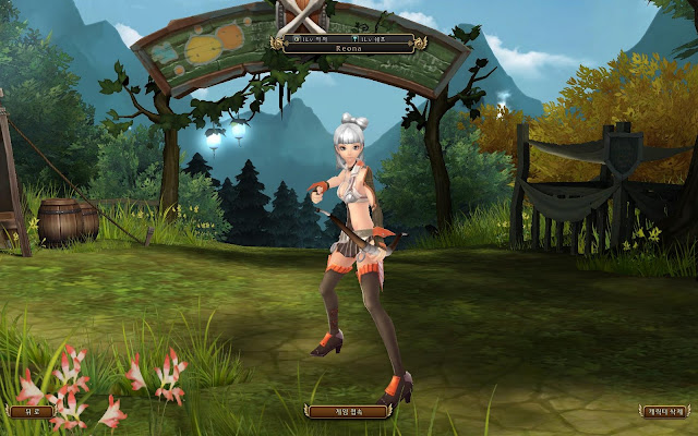 |
| I settled with a chef/ archer combination. |
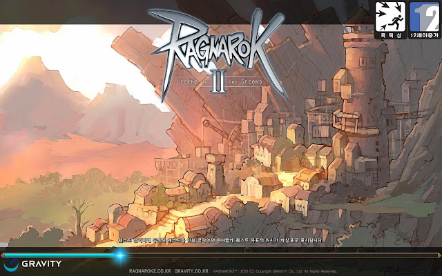 |
| The loading screen. |
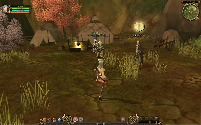 |
| First step into the world of Ragnarok 2! |
 |
| Getting my first quest. |
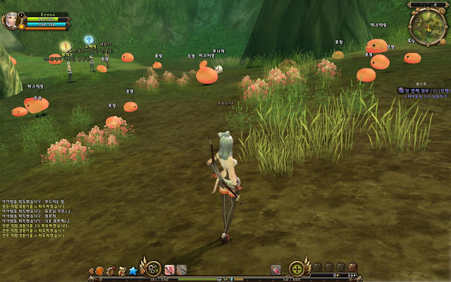 |
| Porings !!!! |
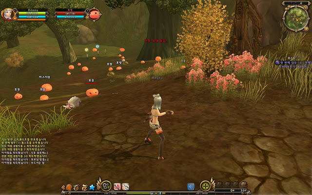 |
The thing which irked me most. Being a traditional point and click MMO is fine with me, but attacks require you to be manually facing the mob! Call me harsh, but having played Dragon Nest (manually facing as well, but its a real action MMO!) and DC Universe Online recently, this is unacceptable for a 2011 game. And not to mention the rather unappealing colors… Oh gosh. I might be trying out the next beta phase, but till then, I am happy with DC Universe 🙂


